SITE UPGRADE INBOUND

Will we need to re-sign in with our passwords on the new site?

That's my understanding from his description above. The system clone (system B or the back-up) gets the upgrade and tests to eliminate any operating issues and at some point the switch-over occurs where system B goes live, all new and shiny. At that point I would expect we'd see something similar to a freeze and a prompt to log in again.

Once we know how the upgrade has to happen, we will let everyone know what it looks like.

Rough Plan:

Clone production
Test and break until we get a repeatable upgrade procedure
Lock out production
Clone production
Upgrade clone
Test
Point DNS at upgraded clone
Unlock new production
Run amok
 
9sraue.jpg
 
Which Friday was it they were switching over?

Today is Friday. Perhaps ...


If a man were to know the end of this day's business ere it come.
But it suffices that the day will end, and then the end be known.
And if we meet again, well then we'll smile.
And if not, then this parting was well made.
-- Julius Caesar Act 5, Scene 1
 
Maybe the server is standing by, awaiting it's expected 30% tip.
 
I'm not a paying customer so I'll enjoy and appreciate whatever service there is.
Connecting with all of you folks is good for my soul.
It would be nice to have the punctuation fixed, though.
 
Agreed. I do check their site and they are the first choice for orders if in stock.

It is weird that you'd only find out about most elsewhere though.
 
I hope that if we get the punctuation fixed,
we don't get a limit of 8000 chars per post.
Which might happen with a software update.

That happened on CGN, and it's annoying -- some of my lists/data, and virtually every news story of merit has to be split over multiple posts.
 
I hope that if we get the punctuation fixed,
we don't get a limit of 8000 chars per post.
Which might happen with a software update.

That happened on CGN, and it's annoying -- some of my lists/data, and virtually every news story of merit has to be split over multiple posts.

I'm surprised you're not happy or elated about it now bumping up your post count as you now need to spread your many fact filled graphs and posts over multiple posts instead of one post?
 
I'm surprised you're not happy or elated about it now bumping up your post count as you now need to spread your many fact filled graphs and posts over multiple posts instead of one post?

I like Bob's graphs. It's refeshing to see stuff that is in line with our reality rather than the one the government and legacy media substitute and try to get us to believe.
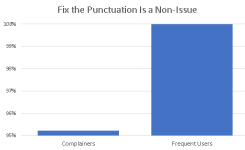
 
I like Bob's graphs.

Why graphs ?

If one wants to lie, do it in a sentence. It's virtually impossible for a human being making an argument to choose anything but biased cherry picked data points in a sentence.
If one wants to see the truth, show it in a multi-year graph.
If one wants to be honest, don't cherry pick the year end points for the graph, but rather round them to either "all the data that's available for every year" or "multiples of 5 years or 10 years before today". (Statcan frequently shows 10 years ago, but not the years in-between, that's semi-honest -- unless they delete 10 year trends when they don't like the tale)

Parliament doesn't allow images -- forcing them to give data in sentences, forcing them to lie.
Liberals take that lying to another level, by literally ignoring facts.

Langmann was once in committee, and showed a multi-year graph. Liberals were red-in-the-face furious.

PolySeSouvient presentations and letters and PDFs and news articles are virtually always sentences.
 
Misleading Graphs: Real Life Examples

Misleading Graphs in Real Life: Overview

Misleading graphs are sometimes deliberately misleading and sometimes it?s just a case of people not understanding the data behind the graph they create. The ?classic? types of misleading graphs include cases where:

The Vertical scale is too big or too small, or skips numbers, or doesn?t start at zero.

The graph isn?t labeled properly.

Data is left out.

But some real life misleading graphs go above and beyond the classic types. Some are intended to mislead, others are intended to shock.

And in some cases, well-meaning individuals just got it all plain wrong. These are some of my favorite recent-history misleading graphs from real life.


https://www.statisticshowto.com/probability-and-statistics/descriptive-statistics/misleading-graphs/


In statistics, a misleading graph, also known as a distorted graph, is a graph that misrepresents data, constituting a misuse of statistics and with the result that an incorrect conclusion may be derived from it.

Graphs may be misleading by being excessively complex or poorly constructed. Even when constructed to display the characteristics of their data accurately, graphs can be subject to different interpretations, or unintended kinds of data can seemingly and ultimately erroneously be derived.

Misleading graphs may be created intentionally to hinder the proper interpretation of data or accidentally due to unfamiliarity with graphing software, misinterpretation of data, or because data cannot be accurately conveyed. Misleading graphs are often used in false advertising. One of the first authors to write about misleading graphs was Darrell Huff, publisher of the 1954 book How to Lie with Statistics.

Data journalist John Burn-Murdoch has suggested that people are more likely to express scepticism towards data communicated within written text than data of similar quality presented as a graphic, arguing that this is partly the result of the teaching of critical thinking focusing on engaging with written works rather than diagrams, resulting in visual literacy being neglected. He has also highlighted the concentration of data scientists in employment by technology companies, which he believes can result in the hampering of the evaluation of their visualisations due to the proprietary and closed nature of much of the data they work with.
 

There must be better examples of misleading charts.

A lot of those are two data point charts -- which may as well be sentences. Choosing a small axis range is a good thing to show fine clarity, but the way it was used just to have a graphic was poor.

Her comment about using two y axis is daft. Using two y axis is the correct and only way to present that data, and it's used every day and does very well when trying to corelate two pieces of data which the graph she's complaining about.

FixThePunctuation.png
-- Source: distinct <span class="username"> within https://www.gunownersofcanada.ca/showthread.php/73958-Fix-the-damned-punctuation
 
[not worth watching]

How to spot a misleading graph - Lea Gaslowitz
2017, 4 minutes
http://y2u.be/E91bGT9BjYk

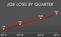
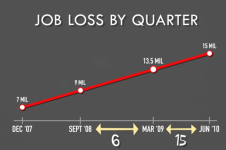
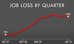
Here they've manipulated the X-axis to change the slope of the line, combined with cherry picking a few points instead of all available data.

JobLossByQuarter1.png

JobLossByQuarter2.png

JobLossByQuarter3.png

(and of course, it's relevant that the chart starts in 2008 (Dec 2007 is 2008), given the 2008 financial crisis. It may be that 2000-2007 data, had it been included, might show a restoration to normal values particularly if adjusted per capita/population, rather than the panic the first graph inspires)
 
I'm surprised you're not happy or elated about it now bumping up your post count as you now need to spread your many fact filled graphs and posts over multiple posts instead of one post?

Impressive. Every word in that sentence was wrong.
-- Luke Skywalker, Star Wars: Episode VIII - The Last Jedi (2017)

Every word of what you just said... was wrong.
-- Luke Skywalker, Star Wars: Episode VIII - The Last Jedi (2017)

  • Obviously I'm neither happy nor elated about it. Otherwise I wouldn't have made post #53. :)
  • My ridiculous post count is mostly due to
    • overzealous participation in the laugh thread
    • a pet peeve of not being able to like a post because there are two memes in one post, one of which is uproariously funny and the other of which is disgustingly offensive -- thus I put one image per post unless it takes multiple images to make one point
  • When I have to post more than 3 graphs/images in one post, I host them on my website. e.g. https://www.gunownersofcanada.ca/showthread.php/75913-Bartok5-s-Collection has 55.
    I also host on my website when GoC's attachment feature (which I otherwise currently really appreciate despite its flakiness) converts it to a jpg of insufficient resolution for it to be readable, and I care about its readability.
 
howd dis go from site upgrades to graph lessons
 
UPDATE JUNE 17

The site is currently on version 4.2.5. vBulletin is now at 6.1.2 for stable release.

There is NO upgrade path that avoids breaking functionality of the site. It was left at 4.2.5 too long.

All of the current plugins have no upgrade path. So, we are going to get the core code to version 6.1.2 stable and then start adding features and functionality back in over time.

EXPECTED DOWNTIME

vBulletin is handling this upgrade with us. They estimate 72 hours of the site being offline as a minimum, but it could go longer if they find unexpected things like code hacks, and custom work arounds.

The good news is if things go completely sideways, we can restore the snapshot backup to the time just before they started and at least end up back here with a (semi) functioning community.

I will update again with dates for this outage once we have that info from vBulletin.

Save someone some jumping back and forth
 
Any idea when this 72 hour blackout might happen?
 
Thanks!

We are working with vBulltein to get that sorted this week.

Its a big job, so they actually need to schedule it internally.

Also, they are the only company we have encountered of late that still sends you an email ASKING FOR ALL THE INFO YOU ALREADY PUT INTO THE ONLINE ORDER so that they can manually check the F#$@#^$ing order. That email always goes to spam or gets missed adding days to the sales cycle.

Bout ready to move this site to fricken Discourse LOL
 
And everyone should check what email they have listeded here for recovery purposes. Let's avoid
Rangebob2
M1918 Enfield
Etc 2
 
Turkish: What's happening with them sausages, Charlie?
Sausage Charlie: Five minutes, Turkish.
Turkish: It was two minutes five minutes ago.
 
So 72 hours was 3 and they did NOT schedule it with me or anyone else. SO now we are fully upgraded.

I will need you folks to help me identify what plugins need to be brought back.

The look and feel is based on the theme. I am going to try and set up a poll and get a vote going on what theme to use.

The log etc will slowly come back as we get the required plugins installed.
 
  • Like
Reactions: Aniest and LB303
Struggling to reply with quote. How am I supposed to sarcastically tell Haywire that the punctuation seems fine from page 1?
 
  • Like
Reactions: Rory McCanuck
BSD, you need to go into your settings and enable or check the signature box to see your and others sig lines. It seems it is not enabled by default
 
Kenny, same thing happens to me when I try to reply to another post. It allowed me before but does not now.


Forgot your password?
Don't have an account? Register now
or